Sparklines, as seen in the overview post on sparklines, are quick, simple charts that can be inserted into the cell of a spreadsheet created with Google Sheets. One of their strengths is their simplicity. However, there are several options that can be used to expand their functionality. Below, we focus on the options available for use with the line graph type of sparkline.
Line graph options
xmin sets the minimum value along the horizontal axis (not shown)
xmax sets the maximum value along the horizontal axis (not shown)
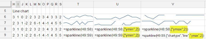
ymin sets the minimum value along the vertical axis.
ymax sets the maximum value along the vertical axis.
color sets the color of the line
empty how to treat empty cells
zerogive the cell a value of zero for the sparklineignoreignore the cell, rendering the chart as if it does not exist- Note in the image that the “ignore” option behaves the same as not designating this option at all.
Video explanation

nan how to treat cells with non-numeric data
convertlet Sheets try to convert the character(s) in the cell to a number. Good luck on this one.ignoreignore the cell, rendering the chart as if that value does not exist- Note in the image that the “ignore” option behaves the same as not designating this option at all.

rtl changes the direction of the chart from left-to-right to right-to-left
trueThe direction of the chart is flippedfalseThe direction of the chart stays the same- Note in the image that the “false” option behaves the same as not designating this option at all.

linewidth specifies the thickness of the line in the chart

Follow image below for the live Google doc with sparklines
![]()
One thought on “Line graph options for Sparklines in Google Sheets with Examples”
Comments are closed.