Rows not hidden yet

Google Sheets – Group Rows and Columns with Linked Example File

When working with spreadsheets of data in Google Sheets, you’re often switching between different levels of information, and you might find yourself wishing you could control the visibility of data you don’t need so that you can make the presentation clearer. There is a way to do exactly this, by grouping rows and columns so you can easily collapse and hide them or expand them into view.

Grouping Rows

In the example below and in this linked example Sheet, we have individual sales data for a range of products, with quarterly subtotals, and an annual total. To see the quarterly sales information more clearly, we would like to hide the data for the individual products.

Rows not hidden yet

To do this, we’ll create groups for the data we don’t need to see. Begin by selecting some rows that you would like to hide.

First row selected

With the rows selected, right-click anywhere inside the selection and select ‘Group Rows 2 – 9’ (or whatever row numbers you have selected) from the menu.

Right-click menu

This will create a group for the selected rows, which you will see depicted by a thin bracket on the left of the selected rows, along with a small button with a minus sign inside it. This button lets you collapse or expand the group.

Minus sign

If you click the minus button, the group of rows will be collapsed and hidden from view. The button remains visible (this time with a plus sign) so that you can click on it again to expand the rows.

Arrow pointing to minus sign

Repeat these steps for each of the other quarterly product data so that you end up with only the quarterly sales figures showing.

Collapsed rows

Now we’re showing only quarterly sales figures, and the data is much easier to read!

Step-by-Step Video

Layered Groups

Let’s say we want to be able to show only annual sales figures as well. We can create another group, alongside the groups we just created, to toggle on and off everything except the annual sales data.

Select all of the rows corresponding to individual product data and quarterly sales figures. Do not include the row with the annual sales figures at the end, or the header row at the top.

Expanded rows

With the rows selected, right-click anywhere inside the selection and select ‘Group Rows 2 – 31’ (or whatever row numbers you have selected) from the menu.

Right-click group rows

This will create a new group that allows us to collapse all the quarterly sales data and only show annual sales data, alongside the groups that we created before.

Second level minus

Now if you click the button for the new group, only the annual sales figures will be showing.

Parent and child rows collapsed

Grouping Columns

It is also possible to create groups for columns, using the same steps as we used for rows. Select the columns that you would like to hide.

Columns selected

Right click anywhere inside the selection and click ‘Group Columns C – D’ (or whatever columns you have selected) from the menu.

Right-click group columns

This creates a group for the columns, depicted above them by a thin bracket and a toggle button, which we can click to collapse or expand the columns as we did with the rows.

Minus columns

Group Options

Right clicking on the group bracket brings up a menu that gives us some options about how to display the group. For example, if you would like the toggle button to appear at the bottom of the group, right click on the group bracket on the left of the rows, and click ‘Move +/- button to the bottom’ from the menu.

Move plus/minus to bottom

You can see there are several other useful options on the menu that give you control over how your data is being displayed.

That’s it!

Grouping rows and columns in Google Sheets gives you control over what is displaying in your spreadsheet, giving you the ability to highlight different levels of information at different times without the view being cluttered with data you don’t need to see. Hope this tutorial has been useful for you and your business!

 Live examples in Sheets

Go to this spreadsheet for examples of grouping that you can study and use anywhere you would like.
Raw data before being used in a pivot table

Google Sheets – Pivot Tables | Summarize by Year, Month or Quarter

Start with a Pivot Table

If you have a table of data in Google Sheets and you want to look at it by a certain type of date, let’s say if you want to look at it by day of the week, the first thing that you want to do is create a Pivot Table. Using a Pivot Table will help you avoid constructing complex formulas with SUMIFS.

We are starting with a table, (shown in the image below) for our raw data and we will be creating the Pivot Table on a new sheet called Pivot Table 1 which is shown at the end of this article in the embedded view of the Sheet.

This tutorial assumes that you have already completed your Pivot Table and you have a basic knowledge of how to use it. See this video if you need some basic help on Pivot Tables.

If you need a primer on Pivot Tables, this video will walk you through them.

Raw data before being used in a pivot table
Raw data used in pivot table

A well-formed table of data

As can be seen in the raw data above, it is important that you start with good data that has descriptive headers for each column and no empty rows. If you have empty rows, be sure to delete them before attempting to create a Pivot Table.

Once you are ready to create your Pivot Table, go to the menus, select Data then Pivot Table. The Blank Pivot table will be created on a new tab in your spreadsheet as shown in the picture below.


College Compare Add-On Icon College Compare
Analyze college data


Insert Special Characters Add-On Icon Insert Special Characters
Symbols, shapes, and more


OmnPivot Logo OmniPivot

Create multi-range pivot tables


StaySorted Logo StaySorted
Automatically sort new entries


TIMEDIF Logo TIMEDIF
Formatted duration between datetimes


TripTally Logo TripTally
Calculate distances

New, blank pivot table
Pivot table before customizing

Add the Dates

To get the dates to be the first column on the left, we want dates to be the rows so add Ship Date to the Rows field. As mentioned above, working with pivot tables is a lot easier if you have descriptive headers in your source data. Each one of these headers is telling us exactly what’s in the column.

Now I have my dates on the left-hand side and then I want show the items in each column. Let’s add items to the Columns field. To fill the table with the number of items shipped, tell it to use the COUNTA function for the Ship Date which will count each instance of a Ship Date as one.

Add the ship date field
Add the ship date field to the rows

Add the ship date to the value field

Group by Day of the Week

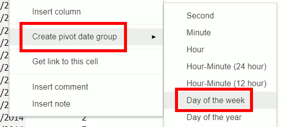
Come over to the column that has the dates in it. Select any one of the days. Right click and do create pivot date group. It doesn’t matter what day you click on in the source table. Google Sheets will give you the option to sort by date or time as long as you left-click on a valid date or time inside the pivot table.

Group the days by day of week

You can do this by week, month, day of the week or even units of time smaller than a day such as hour or minute. Since we are doing Day of the Week, it summarizes all of the data from Sheet1 into Monday, Tuesday, etc. If you have things in this column that aren’t working right, go back to your data and make sure that the dates are valid. There are several different ways to get valid dates and to check and make sure that they’re working. So that’s mostly it. We’ve summarized this data by month with just a few clicks! Now that you have the grouped dates, you create interesting tables like summing by day of the week.

 Live examples in Sheets

Go to this spreadsheet for examples of a grouped pivot table that you can study and use anywhere you would like.