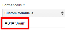
Right now, our custom formula that we built in the previous post is =B1="Joan" and we were applying that formula to column A by using A2:A for the range.
Before formatting the entire row
Custom formula
However, we want to highlight each row, in its entirety instead of just one cell as is shown in this linked Google Sheet.
If you want to learn more about the complex subject of conditional formatting, I have created a course about it over at Datacamp. This is an affiliate link and if you use it to make a purchase I will receive a portion of the proceeds. Thank you for supporting my channel!
Only part of row highlighted
Expanding the Selection
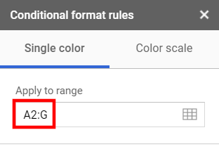
Now, we are going to expand the range used in the “Apply to range” box all the way to column G by entering A2:G into the Apply to range input box. Specifying the range using this syntax will start the range at A2 and expand it down to the end of the spreadsheet and to the right through column G.
Extending the range
Video explanation
Fixing the Formula
If you stop now, it doesn’t change anything. You would think the formatting would extend across the entire row, but it doesn’t. What you need to do is change the formula.
Custom formula with fixed column
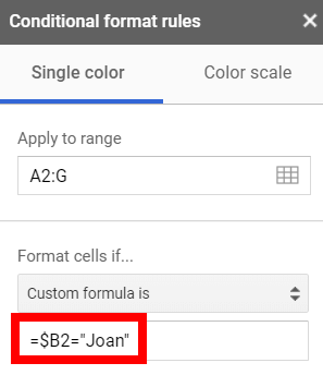
Before this change, the formula was incrementing one cell to right each time it calculated, just like any other spreadsheet formula when it is copied to another cell. Now, we have changed the formula from =B1="Joan" to =$B1="Joan". The dollar sign prevents the formula from moving to the right each time it decides if the conditional formatting criteria is being met. You have told your formula to continue looking at the same column for the criteria as it formats each cell. Just like you would if you were inside a spreadsheet cell, you used a dollar sign to indicate that value shouldn’t move when the formula moves.
The Entire Row is Highlighted
It’s working now since we fixed the column reference. Every row that was a sale by Joan has been highlighted.
Custom formula with fixed column
I hope that was helpful. You can take this into your next presentation and wow everyone. You’ll just be amazing;) Have fun with it.
Live examples in Sheets
Go to this spreadsheet for examples of conditional formatting that you can study and use anywhere you would like.
This article will walk you through how our inventory tracking template is created.
Prepare the Sheet
In order to have all of the right column headers, start the spreadsheet by adding the following labels in the first row:
Item
Beginning balances
Purchases
Sales
Ending balance
Purchase Price
Ending Value
Headers
Enter the Items and Amounts
Enter your item descriptions in the first column under the Item header. When you use this spreadsheet for the first month, you need to hard-code the beginning balances. In subsequent months, you will be able to link the beginning balances to the prior period’s ending balances. We will review how to do that later but, for now, just type your amounts in.
We’re using an ice cream shop as an example so the example is using vanilla as one of the flavors. During the first month, you purchased four units and you sold two.
For the ending balance, you will use a formula. If your table is set up with the same rows and columns as the example, your formula for the ending balance should be =C4+D4-E4.
Ending Inventory
Consider using this template. This is the end result of what are discussing below and what is shown in the video below as well.
Purchase Price and Ending Value
For purchase price, use the last price that you paid for a gallon of this ice cream flavor. That way, the value will reflect the market value closely if it’s the most recent market price. For the ending value, we’re going to take the ending balance, which is column F, multiply it by the latest purchase price, which is G4, =F4*G4 and that’s the ending value of your vanilla inventory.
Ending Value
You need to remember to update the purchase price every time you buy it or it’s not going to reflect the current value.
Watch the video
Total Inventory Value
Next, we’re going to total the value of our inventory. Go to the bottom of the ending value column and type =SUM for your formula. Open up the parentheses and choose the range of all the ending values. I went back in and I filled out some activity for two more flavors of ice cream.
The ending value of this inventory is the total shown in the ending value column. To reflect the proper value of your inventory in your financial records, you need to adjust it to this number if that’s not what the balance is now.
Total Inventory Value
Formatting your Sheet
Let’s do a little bit of formatting so it’s easier to read. In order to get all of the numbers in the value column to have two decimal points, change the formatting to Number by going to the Format menu, choosing Number, and then selecting Number again. Now all of the decimal points are lined up which makes it visually easier to read.
Number Format
Let’s do a bottom border to show that this is the sum at the end of the table. Using a thick line at the end of a column of numbers helps a reader see that it is the end of the series.
Bottom Border
Book to Actual Comparison
After all of your careful tracking, some of your inventory is going to mysteriously shrink, right? Or, you’re going to purchase something and record it incorrectly. In other words, this ending value over the months is going to become inaccurate no matter how hard you try to keep it right.
What you can do is a monthly or a quarterly physical inventory. Let’s add a physical count column. Let’s recheck the purchase price to make sure there are no errors there either. Then, add in actual value using a formula, in this case, of =I6*J6.
Actual Value
You don’t need to do physical counts throughout the month. You don’t really need to do one every month. But, if you want to double check yourself, this is a great way to do it. If any of these amounts or prices are different, the ending value of the count won’t match the ending book value in the spreadsheet to the left.
Adjust your GL
After you do your physical count and you check your prices, this is the dollar amount that you should have recorded in your general ledger as your inventory. For the months that you do a physical count, you should adjust your inventory to actual and then book the difference to your cost of goods sold.
Note that the first worksheet in the template is linked to a second that you can use for a subsequent month. This process can be repeated for as many months as you would like. Link the beginning values of the subsequent month to the ending values of the preceding month. You do this by typing =, left-clicking on the cell that you want in the other worksheet, and hitting enter.
That wraps it up for creating and using your new simple inventory management template. Hopefully you find this helpful for your business!
Template
Go to the template here. Choose File -> Make a Copy to copy it into your drive.
If you’re using a Pivot Table in Google Sheets and you want to create groups within that pivot table, you can do it with just a few clicks.
This tutorial starts with a table of sales transactions and walks you through the steps to group the transactions by region like this.
This walk-through assumes that you have completed your Pivot Table and have a basic knowledge of how to use it. See this video if you need some help on Pivot Tables.
If you need a primer on Pivot Tables, this video will walk you through them.
When you look at the table below, we can see we have different regions. We have West, East, North, and, um, just one mile left of North.
Table of data before being used in pivot table
Build Your Pivot Table
Let’s make the rows of our Pivot Table the value in the Region column from the table of raw data. Select any cell in the table of data and go to Data and Pivot table. This will start to fill your Pivot Table. Click ADD for the rows and select “Region.”
Use the OmniPivot add on to use more than one table as your source.
Selecting Region as the row
To fill in the center of the Pivot Table with data, select ADD for the Values and choose SUM, which is the default. This will show the sum of the sales by Region.
Add Amount as a value and SUM it
Let’s add another value here to make it look more informative. We also care about the item, right? Okay, add that as a column. This will give your Pivot Table a broader display of data.
Add Item as a column
Video Description
Grouping the Data
Now let’s group together the compass directions and then group the One Mile Left of North in another group because he’s a little bit different so we want to analyze him differently. What you want to do is highlight the three that you want to group separately, right-click, and create a Pivot group, as shown in the image below.
Add the Pivot Table Groups
Now, the Pivot Table has put the three compass direction territories together and then the one oddball. Now you can expand and collapse these groups in the same way that you can in a spreadsheet without a Pivot Table. That’s the way to group data in a Google Sheets pivot table. That’s all.
Live examples in Sheets
Go to this spreadsheet for examples of pivot table groupings that you can study and use anywhere you would like.
If you have a table of data in Google Sheets and you want to look at it by a certain type of date, let’s say if you want to look at it by day of the week, the first thing that you want to do is create a Pivot Table. Using a Pivot Table will help you avoid constructing complex formulas with SUMIFS.
We are starting with a table, (shown in the image below) for our raw data and we will be creating the Pivot Table on a new sheet called Pivot Table 1 which is shown at the end of this article in the embedded view of the Sheet.
This tutorial assumes that you have already completed your Pivot Table and you have a basic knowledge of how to use it. See this video if you need some basic help on Pivot Tables.
If you need a primer on Pivot Tables, this video will walk you through them.
As can be seen in the raw data above, it is important that you start with good data that has descriptive headers for each column and no empty rows. If you have empty rows, be sure to delete them before attempting to create a Pivot Table.
Once you are ready to create your Pivot Table, go to the menus, select Data then Pivot Table. The Blank Pivot table will be created on a new tab in your spreadsheet as shown in the picture below.
To get the dates to be the first column on the left, we want dates to be the rows so add Ship Date to the Rows field. As mentioned above, working with pivot tables is a lot easier if you have descriptive headers in your source data. Each one of these headers is telling us exactly what’s in the column.
Now I have my dates on the left-hand side and then I want show the items in each column. Let’s add items to the Columns field. To fill the table with the number of items shipped, tell it to use the COUNTA function for the Ship Date which will count each instance of a Ship Date as one.
Add the ship date field to the rows
Add the ship date to the value field
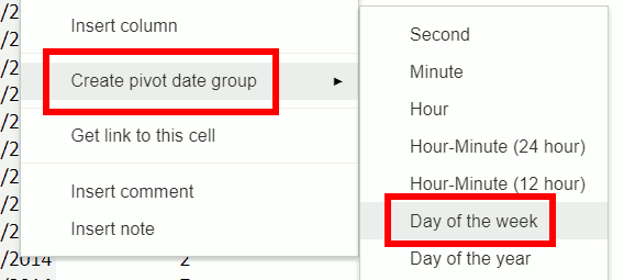
Group by Day of the Week
Come over to the column that has the dates in it. Select any one of the days. Right click and do create pivot date group. It doesn’t matter what day you click on in the source table. Google Sheets will give you the option to sort by date or time as long as you left-click on a valid date or time inside the pivot table.
Group the days by day of week
You can do this by week, month, day of the week or even units of time smaller than a day such as hour or minute. Since we are doing Day of the Week, it summarizes all of the data from Sheet1 into Monday, Tuesday, etc. If you have things in this column that aren’t working right, go back to your data and make sure that the dates are valid. There are several different ways to get valid dates and to check and make sure that they’re working. So that’s mostly it. We’ve summarized this data by month with just a few clicks! Now that you have the grouped dates, you create interesting tables like summing by day of the week.
Live examples in Sheets
Go to this spreadsheet for examples of a grouped pivot table that you can study and use anywhere you would like.
This tutorial will show you how to create an interactive to-do list in Google Sheets including automatic strikethroughs when you mark tasks complete with a checkmark.
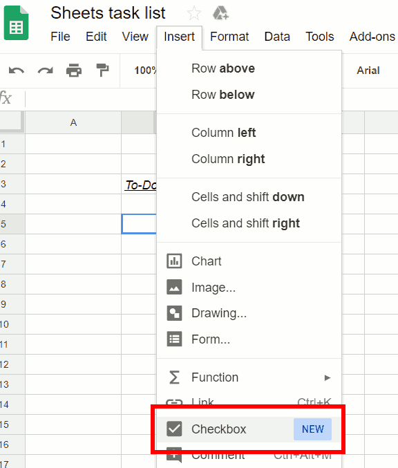
Insert Checkboxes
Insert-> Checkbox
As shown in the image above, the core functionality of this list will be driven by checkboxes. You can enter them into your spreadsheet by going to the Insert menu and choosing Checkbox. Insert one and then copy and paste it down until you have as many as you want. Add your tasks in the column to the right of the checkboxes.
Now, if you’re like me, when you’re done with the task, you’d love to be able to check it off and get a little strikethrough, right? You can feel like you’re accomplishing something. The strike through will come from using the conditional formatting feature.
Conditional formatting menu option
After selecting Conditional formatting, a Conditional formatting rules box will appear on the right. Look closely at the picture below. For the range, we have specified C5:C which will select everything in column C from row 5 and below, assuming that is where you have placed your list of tasks. Once you move out of this input field, you should see that everything in column C starting a row 5 and down to the end of where you have things typed is highlighted.
If you want to learn more about the complex subject of conditional formatting, I have created a course about it over at Datacamp. This is an affiliate link and if you use it to make a purchase I will receive a portion of the proceeds. Thank you for supporting my channel!
Conditional formatting rules
Watch the Video
Custom formula
Right now, it’s just applying formatting as Cell is not empty because that’s the default choice. Change that by going to the drop down menu below Format cells if… and choosing Custom formula is. Now this box is waiting for a custom formula. Left-click into it to put the cursor in it. Whenever you’re typing a formula, even if it’s in here, you start it with an equals sign. Type the formula =B5=TRUE. Make sure you don’t use the period at the end. When a checkbox is checked, it changes the value of the cell from FALSE to TRUE. This formula will check for the TRUE state.
If the value is true, we will apply CustomFormatting style. Choose a style to make strike it through and make the background gray so it looks like it’s going away.
If you want to add something else at the bottom, you won’t have to redo this rule because that formatting contains the entire column after C5.
Completed Task List
Pretty easy to put together. Really satisfying to use. Have some fun with it, and let us know how it turns out.
Live examples in Sheets
Go tothis spreadsheet for examples of adding and subtracting days, months, or years that you can study and use anywhere you would like.