Sparklines, as seen in this overview post on sparklines, are quick, simple charts that can be inserted directly a the cell of a spreadsheet created with Google Sheets. One of their strengths is their simplicity. However, there are several options that can be used to expand a sparkline’s functionality. Below, we focus on the options available for use with the bar chart type of sparkline.

Bar chart sparkline options
max determines the maximum value on the horizontal (x) axis
![]()
"max",12 Note that this is the value in the first cell so the entire chart is representing just that one value.

"max",21 Note that this is the sum of the values in the first two cells so the entire chart is representing just these two values.
![]()
"max",61 This is the value of all of the cells added together the chart is the same as if you had not specified a max value.

"max",61 This is the value of all of the cells added together the chart is the same as if you had not specified a max value. Note that barcharts must use absolute values as the chart is rendered the same way whether or not the cells are negative.

"ma",75 setting of 75. This chart illustrates that you can specify a chart max larger than the chart itself and the chart will scale down.
color1 determines the first color color used for bars in the chart

"color1","red" setting of red. Note that is changes the 1st, 3rd, 5th color, etc
color2 determines the second color color used for bars in the chart

"color1","red" and "color2","yelow" Note that this changes not only the first and second colors, but all of the colors.
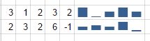
empty how to treat empty cells
![]()
No empty parameter is set for this sparkline bar chart
![]()
zero give the cell a value of zero for the sparkline
![]()
ignore ignore the cell, rendering the chart as if it does not exist
nan how to treat cells with non-numeric data
convertlet Sheets try to convert the character(s) in the cell to a number. Good luck on this one.ignoreignore the cell, rendering the chart as if that value does not exist- Note in the image that the “ignore” option behaves the same as not designating this option at all.
rtl changes the direction of the chart from left-to-right to right-to-left
trueThe direction of the chart is flippedfalseThe direction of the chart stays the same- Note that the “false” option behaves the same as not designating this option at all.
Video explanation
Related Post
Learn how to use bar charts to show ranking data in Google Sheets.


 Column