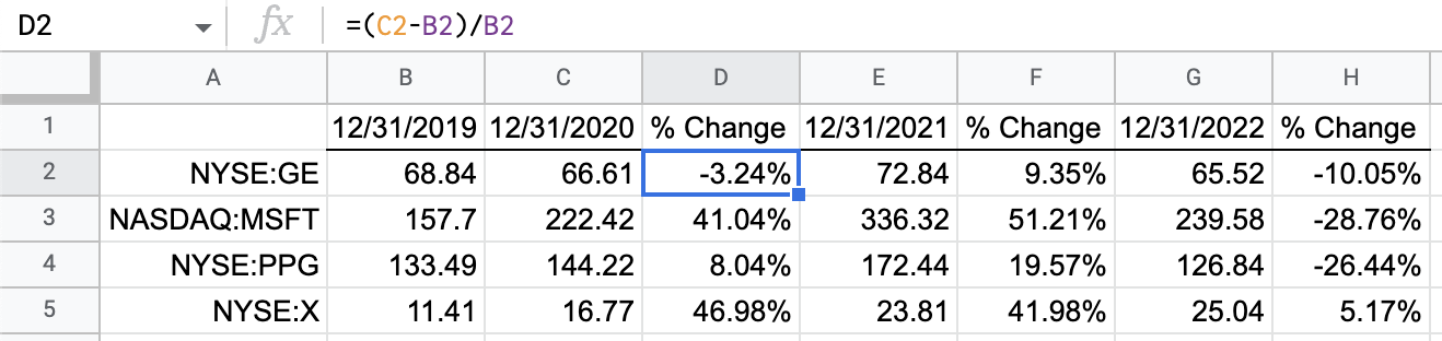
We imported stock data using the GOOGLEFINANCE function in our previous post; now we’re creating visuals with that data. The historical stock prices and changes in those stock prices are shown in this table.
As we are only interested in the change over time, let’s clean up this table a bit. We’ll delete the stock prices and keep the percentages of change. Before you delete the prices, copy the percentages and paste thems as values. That way, the percentages will no longer rely on the formulas being deleted.
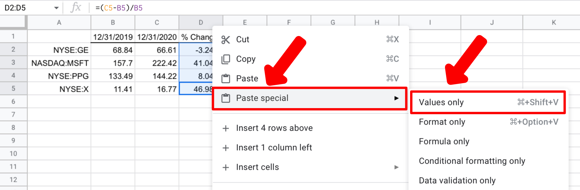
Now you can safely delete the columns with the stock prices. Our data is cleaned up and ready to go.

Using a Chart to Visualize Stock Data
The obvious tool to visualize changes is a chart. You can create a chart using the Insert menu, but we’ll choose the easy way. Google Sheets has a tool called Explore. This tool anticipates the most useful graphical insights and offers them in a sidebar. You can pick from the options and insert them into your spreadsheet. Using Explore will significantly reduce the steps needed to create a chart. First, we’ll highlight the range we want, including the headers, then click the Explore button.


Custom Formatting to Show Changes
We are familiar with charts but can also illustrate change through custom number formatting. One advantage of custom formatting is that it sits inside the cells. This allows the illustration to be contained within the data. Also, custom formatting scales better as it can be used in as many rows as needed when a chart gets too busy with lots of data.
First, let’s highlight the cells to be formatted then go to the Format menu, choose Number, then Custom number format. This brings up the Custom formatting options.

Once you choose Custom number format, you will get another window. This window is where we tell Google Sheets how to format numbers when negative and positive. Since we can differentiate, we can make the formats look different depending on the direction of change – negative for down and positive for up.

Custom Formatting Syntax
Let’s use the input box of the Custom number formats window to create a new custom number formatting rule. We will start with the basics.
Input
0; -0; “-”
Output
Formats a positive number as 0
Formats a negative number as -0
Shows zero as a dash (“-“).
Add Color to Custom Number Formatting
As stated earlier, you can add colors to your numbers for easy understanding.
To achieve customized color for your data, type the following syntax:
0[Green]; -0[Red]; ‘-‘[Black]
NOTE: The name of the color for each number format will come after each of the numbers in parentheses. Make sure you enclose the color for each cell in square brackets. The name for positive numbers is GREEN. Negative numbers are assigned RED. Zero will appear in BLACK.
How to Insert Special Characters in Your Data in Google Sheets
We’ll add arrows to the formatting to emphasize the direction of change. However, there is no built-in option to insert special characters.
To achieve this
- Go to the Google Workspace Marketplace and grab a copy of the Insert Special Characters Add-On.
- Install the add-on and use the new sidebar to select and insert the characters.
Use these triangles in the custom format rules with a triangle pointing up to show and increase and down to show a decrease.

Now apply the completed rules to the table of percentages. You can see the trends more clearly now with the help of colors and arrows.

In conclusion, the techniques shown in the article will help you tell the story of your data in the most compelling way possible.