What is a scatter chart?
A scatter chart (AKA scatter plot or XY graph) uses points along a two-dimensional graph to show the relationship between two sets of data. Its simplicity can make it quite effective at cutting through the noise of large amounts of data in a Google spreadsheet. Once you can see the relationship, it can be used to predict future outcomes within certain confidence levels.
When to use a scatter chart
Before you jump into using a scatter chart, be sure that it is the right type of chart for you. This chart type decision tool can help you decide.
As an example, if you want to see if more people will use the water park as it gets warmer, a scatter chart could be a good tool. If you use any more than two variables, the chart can start to appear confusing and thus reduce its usefulness.
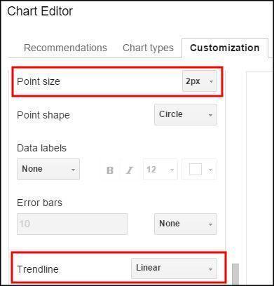
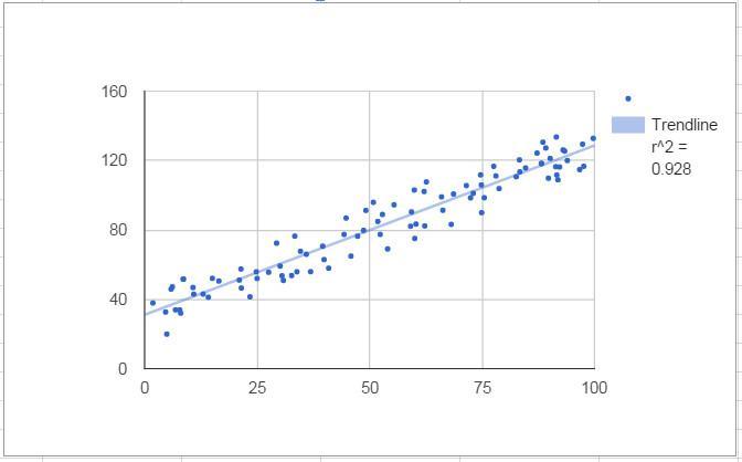
These charts can be customized in many ways. The first example below has had its points reduced to 2 px, a linear trendline added, and the correlation shown in the upper right hand corner of the chart. These options can be found on the customize menu when inserting a chart.
Video Explanation
Correlation
Mathematically speaking, creating a scatter chart lets you visualize the correlation between data points, if there is any. In the example above, the correlation is .928, with the highest value of any correlation being 1. The chart was created in Google Sheets using random values for the Y axis and (Y + random values) for the X axis. The random value range was kept small so that it would create a tight correlation. Most users for which a spreadsheet chart is made will probably not remember what a correlation value means. A trendline is the layman’s tool for seeing the correlation.
Trendline
You can draw a line through the data along the path which is the best fit based on the points already on the chart. You can see how close the correlation is to 1 or negative 1 by simply looking at the distance that the dots are away from the line. This line can be used to extrapolate correlations outside of the current data. If you are trying to find data points inside the current set, it is called interpolation. This line can be straight (linear), or it can be a curve (exponential or polynomial).

Linear
Below is a simple scatter chart with a correlation value of 1. This means that each of the two variables move in lock step with eachother in the same direction. If the left shoes size increases by one, so does the right. The line of best fit with a perfect correlation is linear and extends 45 degrees from left to right. Note that it will only be 45 degrees on the chart if the scale of the x and y axis are the same scale.

Some types of data could have a negative correlation. For example, the relationship between BTU’s needed to heat a room and the outside temperature would create a graph that slants down as it moves along the x axis.

Of course, not all data are so highly correlated. If it were, there would be no “scatter” in a scatter chart. This chart shows data with a correlation between -1 and 1. Note that the slope calculation and correlation value were included in the chart by choosing “Use Equation” as the label and placing a checkmark next to R2 to the correlation in the customization are of the chart menu.


Exponential
Exponential trendlines are a good fit for data that increase or decreases at a constantly increasingn rate.

Polynomial
A polynomal trendline should be used when data flucuates between values. Note that the polynomial trenline is more tightly correlated with this data. The data is the same as the data used for the exponential trendline.

Error Bars
To illstrate that your data in not precise and may be within a certain range, error bars can be used. These bars are found in the customization menu and be set for different ranges in percentage or absolute terms. The chart below shows error bars added to a simple scatter chart to show uncertainty in the data. They were created by using a constant value of 2.25. These can be used with our without a trendline depending on the point that you are trying to make to the viewer of your chart.

A. Matulich says:
If I have a series of x,y measurements, and a polynomial expression representing the underlying model (not the “best fit” built-in trendline feature), how would I mix the scattered plot of points with the line plot of my model?
This is a basic requirement for any technical graph, and I have never found a way to do it in Google Sheets. In Excel, you can have scatter plots with or without lines.