Start with Good Data

The table of data in the image above is a good example of what makes good data for a Pivot Table. It has headers and the names of the headers describe the data that’s underneath it. The Sales Rep header is on a column that contains the names of the sales reps (duh). More importantly, there are no breaks in this data meaning that there are no blank lines. Also, the table is so large that you can’t just look at it and get the information. If the table of data was small, there could be no need for a Pivot Table since you could see all of your answers by eyeballing the data yourself.
Video Explanation
Create Your Pivot Table
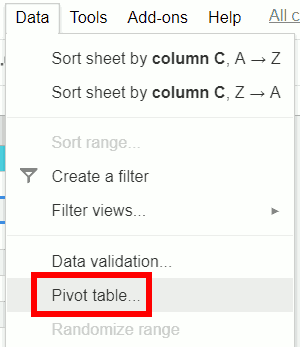
Make sure that you have selected a cell within the source table of data, then go to the menu, choose Data, and Pivot table as shown in the image above. Use the OmniPivot add-on if you have more than one data range. Creating a pivot table gives you a blank slate that you’re going to work with. Sheets will “suggest” different Pivot Table configurations using artificial intelligence as shown in the image below. Unless you have very simple data and you want to have it summarized by one dimension, you are not going to guess what you want because there are so many different combinations. But, if you try one of these and click on it, it will build a table for you, which can be helpful if you have simple needs.

Add Data to the Pivot Table
Now we will start building out our Pivot Table. If we want to analyze the data by Sales Rep first and get the Sales Reps’ names going down the left-hand column, this is where it gets a little bit confusing, and it may be more clear to watch in the video. You want the Sales Reps names in the leftmost column, but you would like the name of each salesperson to be in a row. You need to add the Sales Rep for Rows even though these rows will be filling the first column. Sheets will fill them into the Pivot table in alphabetical order.
For the columns, you want the Ship Mode, and again, this is confusing. It’s going to be your row of headers, but each column is going to have the data in it so it’s called Columns. Let’s add the Ship Mode.


You’ll notice that each time you add a field, it asks if you want to show the totals. Let’s leave both checked, and there will be a Grand Total for the Sales Rep and a Grand Total for the Ship Mode.

The Values field will be what it shows you in the middle of your pivot table. For this table, we will look at the number of sales, not the dollar amount. Go to values and add our Sales column. It’s the field with the dollar amounts in it. Sheets defaults to summing dollar amounts. We want to count each of them as one, so we will change the function from SUM to COUNT.


Add the Dates
Now that we have Sales Rep and a count by each Ship Mode, the last thing we want to do is look at the data by year. Let’s have the dates on the left-hand side to the right of Sales Reps. Remember, this is called rows, even though it’s a column. Let’s add another row column, and we will make it the date.


Group the Dates
This isn’t what you want. We want it by year, but to do that, you had to add the dates. You can right-click on any of the dates, create a pivot data group, and select Year. More detailed information on how to summarize dates in a pivot table can be found here.

This is going to summarize the data by year because Google Sheets recognizes the data as valid dates. It can extract the Year and summarize by just that.

Filter by Date
Let’s say you’re just looking for 2018. Let’s go back to the right and scroll down to the filters. We’re going to add a filter for the date. It will be tricky how we’re going to do this. The drop-down says it’s showing all items. Select clear, type in 2018, and choose select all.


What we’re doing here is saying to unselect everything and show no dates. Then, if you type in 2018, it’ll show only the 2018 dates in the original table. If you click select all, it will only show the 2018 dates. Click OK. You have this filtered by 2018. Click OK, and there you are.
Completed Pivot Table
This is an easy-to-understand pivot table with just the data that you need. If you want to change anything, this is always live.ize it however you like. So that’s all. We’ve taken a solid list of data that has columns with consistent data types in it, no blanks, and I could go back here and custom created this pivot table that gives you the exact information that you wanted to see.

Google Sheets – Group Data Inside a Pivot Table
Pivot Table Groups
If you’re using a Pivot Table in Google Sheets and you want to create groups within that pivot table, you can do it with just a few clicks.
This tutorial starts with a table of sales transactions and walks you through the steps to group the transactions by region like this.
This walk-through assumes that you have completed your Pivot Table and have a basic knowledge of how to use it. See this video if you need some help on Pivot Tables.
If you need a primer on Pivot Tables, this video will walk you through them.
Raw Data
When you look at the table below, we can see we have different regions. We have West, East, North, and, um, just one mile left of North.
Build Your Pivot Table
Let’s make the rows of our Pivot Table the value in the Region column from the table of raw data. Select any cell in the table of data and go to Data and Pivot table. This will start to fill your Pivot Table. Click ADD for the rows and select “Region.”
Use the OmniPivot add on to use more than one table as your source.

To fill in the center of the Pivot Table with data, select ADD for the Values and choose SUM, which is the default. This will show the sum of the sales by Region.

Let’s add another value here to make it look more informative. We also care about the item, right? Okay, add that as a column. This will give your Pivot Table a broader display of data.

Video Description
Grouping the Data
Now let’s group together the compass directions and then group the One Mile Left of North in another group because he’s a little bit different so we want to analyze him differently. What you want to do is highlight the three that you want to group separately, right-click, and create a Pivot group, as shown in the image below.

Now, the Pivot Table has put the three compass direction territories together and then the one oddball. Now you can expand and collapse these groups in the same way that you can in a spreadsheet without a Pivot Table. That’s the way to group data in a Google Sheets pivot table. That’s all.