If you are using Google Slides to create a presentation with data from a Google Sheet, you may want to show that data as a linked table. If you create the table in Google Slides with no linking, it will not update if the data in the Google Sheet changes. Also, this is double work as the data is already in the Sheet, so re-typing it is a waste of time. Below are instructions on how to embed a live Google Sheet directly into your Google Slide. The table that is created will update with one-click and can be styled however you like. Live links to the Slide and Sheet shown in this tutorial are at the end of this article.
Delete the existing text box
Slides wants a blank area for the table. If you have a text box in your slide, delete it to make a nice, big open space.
Text box to be deleted
Watch the video
Create the Sheet
You need a spreadsheet created in Google Sheets with the table of data that you want to display in your Google Slide. In your spreadsheet, highlight the range that you want, right-click, and select Copy.
Table to be copied
Paste it into your Slide
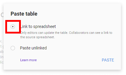
Then, go to the location in your Google Slides where you would like the table to be inserted. Right-click with your mouse and choose Paste. After clikcing, a window will pop-up asking you if you want to Link to spreadsheet or Paste unlinked. Choose Link to spreadsheet and click Paste.
Choose Link to spreadsheet
Oh yes, that’s a live, linked table that you’re seeing.
Google Slide with embedded Sheet
Working with your embedded table
Updating the embedded table
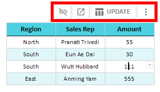
After linking the table, if you want to change the data within the table, you can go back to the Google Sheet to make the changes. When you come back to the Google Slide after making the changes, there will be a new option available to update the table when you right click on the table as shown in the picture below.
Adding rows
If you add rows to your table in Sheets, you may notice that the added rows don’t show up in the linked table in Slides. You will need to go back to the table in Slides after making the change, left click the more button (three vertical dots), and choose Change range.
Option to change the range
Conclusion
Following the steps above should provide you with an easy way to insert a live, linked spreadsheet into your Google Slides. Enjoy!
Google Sheets allows you to build pivot tables to summarize large data sets. When building the pivot tables, you can also add fields that perform calculations on the data once it is in the pivot tables as shown in this live Google Sheet. These calculated fields are a must-have in certain situations as you may want to add/subtract/multiply/etc summarized data from the pivot table that doesn’t exist in the original data being pivoted. For example, if you have a table of salaries and years of college each employee attended, you may want to calculate the return for each year of college. To do this, you would first summarize the data by average salary for each group, then perform the division to arrive at the average after the data is summarized.
This tutorial assumes that you have completed your Pivot Table and know how to use it. See this video if you need some basic help on Pivot Tables.
If you need a primer on Pivot Tables, this video will walk you through them.
The “Salary per year of college” column above is a Calculated Field that is the quotient of the first and second column as seen in the Pivot Table parameters below which can be seen on the right-hand side of your browser screen when you select a field inside the Pivot Table.
Pivot table parameters used to create this Pivot Table
Pivot table calculated fields can allow you to leave the original data in its raw, untouched form. Then, you can use the pivot table to present the data however you would like without changing the original data given to you. Further, it is easier to calculate the average after summarizing the data. It is the average of the summarized data that you are after.
To insert a calculated field, you should first build your pivot table. Then, once you have the data pivoted, you can insert the calculated field using the options on the right side of the screen. As of the date of this writing, this can only be done on the desktop browser version of Sheets.
Live examples in Sheets
Go to this spreadsheet for an example of a pivot table with a calculated field that you can study and use anywhere you would like.
A scatter chart (AKA scatter plot or XY graph) uses points along a two-dimensional graph to show the relationship between two sets of data. Its simplicity can make it quite effective at cutting through the noise of large amounts of data in a Google spreadsheet. Once you can see the relationship, it can be used to predict future outcomes within certain confidence levels.
When to use a scatter chart
Before you jump into using a scatter chart, be sure that it is the right type of chart for you. This chart type decision tool can help you decide.
As an example, if you want to see if more people will use the water park as it gets warmer, a scatter chart could be a good tool. If you use any more than two variables, the chart can start to appear confusing and thus reduce its usefulness.
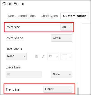
These charts can be customized in many ways. The first example below has had its points reduced to 2 px, a linear trendline added, and the correlation shown in the upper right hand corner of the chart. These options can be found on the customize menu when inserting a chart.
Customization menuExample scatter chart
Video Explanation
Correlation
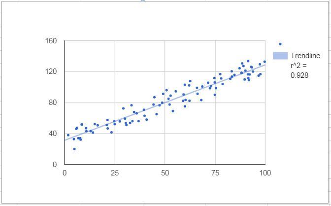
Mathematically speaking, creating a scatter chart lets you visualize the correlation between data points, if there is any. In the example above, the correlation is .928, with the highest value of any correlation being 1. The chart was created in Google Sheets using random values for the Y axis and (Y + random values) for the X axis. The random value range was kept small so that it would create a tight correlation. Most users for which a spreadsheet chart is made will probably not remember what a correlation value means. A trendline is the layman’s tool for seeing the correlation.
Trendline
You can draw a line through the data along the path which is the best fit based on the points already on the chart. You can see how close the correlation is to 1 or negative 1 by simply looking at the distance that the dots are away from the line. This line can be used to extrapolate correlations outside of the current data. If you are trying to find data points inside the current set, it is called interpolation. This line can be straight (linear), or it can be a curve (exponential or polynomial).
You can choose from several types of trendlines
You can choose from several types of trendlines
Linear
Below is a simple scatter chart with a correlation value of 1. This means that each of the two variables move in lock step with eachother in the same direction. If the left shoes size increases by one, so does the right. The line of best fit with a perfect correlation is linear and extends 45 degrees from left to right. Note that it will only be 45 degrees on the chart if the scale of the x and y axis are the same scale.
Scatter chart with correlation value of 1
Some types of data could have a negative correlation. For example, the relationship between BTU’s needed to heat a room and the outside temperature would create a graph that slants down as it moves along the x axis.
Scatter chart with correlation value of -1
Of course, not all data are so highly correlated. If it were, there would be no “scatter” in a scatter chart. This chart shows data with a correlation between -1 and 1. Note that the slope calculation and correlation value were included in the chart by choosing “Use Equation” as the label and placing a checkmark next to R2 to the correlation in the customization are of the chart menu.
Setting labels for trendlines
Scatter chart with correlation value shown on chart
Exponential
Exponential trendlines are a good fit for data that increase or decreases at a constantly increasingn rate.
Scatter chart with an exponential trendline
Polynomial
A polynomal trendline should be used when data flucuates between values. Note that the polynomial trenline is more tightly correlated with this data. The data is the same as the data used for the exponential trendline.
Scatter chart with a polynomial trendline
Error Bars
To illstrate that your data in not precise and may be within a certain range, error bars can be used. These bars are found in the customization menu and be set for different ranges in percentage or absolute terms. The chart below shows error bars added to a simple scatter chart to show uncertainty in the data. They were created by using a constant value of 2.25. These can be used with our without a trendline depending on the point that you are trying to make to the viewer of your chart.
If you are working on a large table of data in Google Sheets, often it is helpful to be able to see and edit more than one area of the spreadsheet at a time. This is not available from the menus in Sheets and is one of the few ways in which Excel is superior to Sheets. There is the option to Freeze rows or columns, but the frozen section of the spreadsheet will not independently move and therefore the Freeze option is limited to applications such as freezing headers at the top or side of a spreadsheet. Further, if you headers are half way down the spreadsheet, the Freeze option will not do you any good.
The solution
If you are working on a mobile device you may be out of luck, but if you are accessing Sheets through a browser, there is a great work around that will allow you to see the same spreadsheet in two or more different windows. You can even spread these views over multiple monitors which you cannot do in Excel without some pretty nasty workarounds.
Watch the video
If you are using the Chrome browser, do the following:
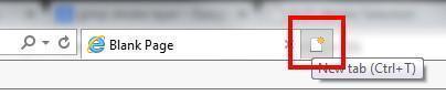
First, be sure to have your spreadsheet open in your browser. Then, open a new browser tab by pressing “t” while holding down the control button (ctl+t) or clicking the shape to the right of your open tab.
Once you have a new tab open, the first thing you do is open the same spreadsheet again in this new window. Now, you have the spreadsheet open in two places. You can edit it in either window. Click and hold your left mouse button on the middle of the new tab, where the title of the page is, and pull the tab away from the browse. In browsers other than chrome, you may have have to open another browser window. This creates a new window with a separate instance of Chrome (or other browser) but keeps the spreadsheet inside of it.
If you want more windows, just repeat the same process. To rearrange the windows, you can use the Windows key. Hold the Windows key down and press the left arrow to have the window fill up the left half of the screen and the right arrow for the right half. You also can resize the windows the more traditional way with your mouse. If you have multiple monitors, you can spread these windows across them.
Using multiple tabs in other browsers
Update: Thanks to ADTC in the comments below for this tip. If you’re using Chrome, you can just right-click on the tab that you’re using and choose duplicate.
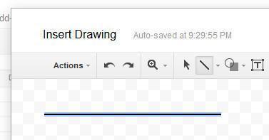
If you are using Google Sheets, you may be having some trouble finding how to insert a line. Once you have figured out how to insert it, getting it to be straight can be frustrating. Follow these easy steps to get it done.
Go to Insert, then Drawing.
From here, choose Line.
Now, here’s where the real trick comes in. If you want to draw a line, go ahead. But, if you want to draw a straight line, hold down the shift key while you draw! There it is, a straight line.