Overview
If you’re using Google sheets and you have a list of amounts that you want to sum or count based on the background color of the cells, there’s no built-in function to do it. However, there are a relatively easy set of steps to make your own functions to get it done. You’ll be able to count based on cell color and you’ll be able to sum as well.
**This technique has been updated. There is a new YouTube video showing an easier way with this Sheet**.
Custom formulas in action
Count by cell color
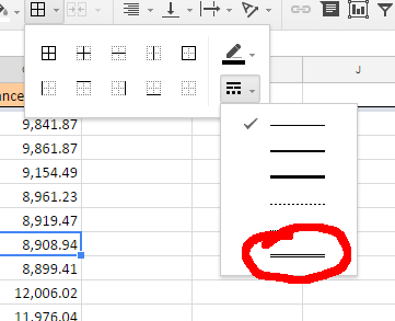
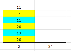
If you look in the live spreadsheet, you will see the custom formulas being used for summing and counting by cell color. The counting is done by a formula with the nice little name of countColoredCells which takes the range and cell with the background color that you want as its two inputs. You want to count B4 through B9 and you want to count the number of cells that have the background color used in cell B8, which is the light blue cell with the dotted line around it.

If you change the second parameter above from B8, a light blue cell, to B5, a yellow cell, the result would be 3 because there’s three yellow cells.
Sum by cell color
sumColoredCells is returning a 24 which is the sum of all the light blue cells. It is similar to the count function – it is summing the colored cells in B4 through B9 that are formatted like B8.

Creating custom formulas
How do we make these functions and any other custom function that you’re so inclined to write? First, go to Tools and you go to Script editor... Don’t worry, we’re just going to copy and paste code below. The code for countColoredCells was obtained from this page at iGoogleDrive.
 /**
* @param {range} countRange Range to be evaluated
* @param {range} colorRef Cell with background color to be searched for in countRange
* @return {number}
* @customfunction
*/

function countColoredCells(countRange,colorRef) {
  var activeRange = SpreadsheetApp.getActiveRange();
  var activeSheet = activeRange.getSheet();
  var formula = activeRange.getFormula();

  var rangeA1Notation = formula.match(/\((.*)\,/).pop();
  var range = activeSheet.getRange(rangeA1Notation);
  var bg = range.getBackgrounds();
  var values = range.getValues();

  var colorCellA1Notation = formula.match(/\,(.*)\)/).pop();
  var colorCell = activeSheet.getRange(colorCellA1Notation);
  var color = colorCell.getBackground();

  var count = 0;

  for(var i=0;i<bg.length;i++)
    for(var j=0;j<bg[0].length;j++)
      if( bg[i][j] == color )
        count=count+1;
  return count;
};
And this code for sumColoredCells was obtained from the same blog, but a different page.
 /**
* @param {range} sumRange Range to be evaluated
* @param {range} colorRef Cell with background color to be searched for in sumRange
* @return {number}
* @customfunction
*/

function sumColoredCells(sumRange,colorRef) {
  var activeRange = SpreadsheetApp.getActiveRange();
  var activeSheet = activeRange.getSheet();
  var formula = activeRange.getFormula().toString();
  formula = formula.replace(new RegExp(';','g'),',');


  var rangeA1Notation = formula.match(/\((.*)\,/).pop();
  var range = activeSheet.getRange(rangeA1Notation);
  var bg = range.getBackgrounds();
  var values = range.getValues();

  var colorCellA1Notation = formula.match(/\,(.*)\)/).pop();
  var colorCell = activeSheet.getRange(colorCellA1Notation);
  var color = colorCell.getBackground();

  var total = 0;

  for(var i=0;i<bg.length;i++)
    for(var j=0;j<bg[0].length;j++)
      if( bg[i][j] == color )
        total=total+(values[i][j]*1);
  return total;
};
Script editor
After you go to Tools then Script editor, you come up with a blank screen. But if you don’t, just do a new script file. Paste the code into the blank window. Repeat for each code section above and name them countColoredCells and sumColoredCells. For each file, the script editor puts the “.gs” at the end of the file name which indicates that it is a Google Script. After you make these two, save them, come back to your spreadsheet, type in the formulas, and it should work for you. See the video and live spreadsheet for further clarification.
Live examples in Sheets
Using a plugin
As an alternative to the technique above, you may want a plugin to do the heavy lifting for you. I like to use a plugin called Power Tools. This will give you a menu option with, among other things, the ability to run functions by color.